Therefor Group Brand Identity Design


After 30 years building a prominent reputation in Southeast Queensland, Wolters Consulting Group was ready to start a new chapter of the business.
Client: Therefor Group
Location: Queensland
MODE Expertise: Graphic Design, Marketing Strategy
Project Leads: Troy Matheson
Completion Date: January 2025
Therefor Group Brand Identity Design
Transforming a brand who transforms places for people.
After 30 years building a prominent reputation in Southeast Queensland, Wolters Consulting Group was ready to start a new chapter of the business.
After the retirement of its founder and namesake, the new leadership team saw the chance to review and reframe the company as it moved forward. The board and executive groups had already completed significant corporate planning when they approached MODE’s experienced graphic design studio to help navigate the rebranding process.
Strategic process
An initial workshop discussed a variety of branding positioning strategies along with the related pros and cons. It was quickly apparent that the opportunity to transition to a new identity was uniquely timed with the new leadership and a planned move of head offices.
The strategy phase also included a lot of market research and competitor analysis to position the new brand correctly and uniquely. This covered a diverse range of sectors and levels of sophistication to manage.
The concept
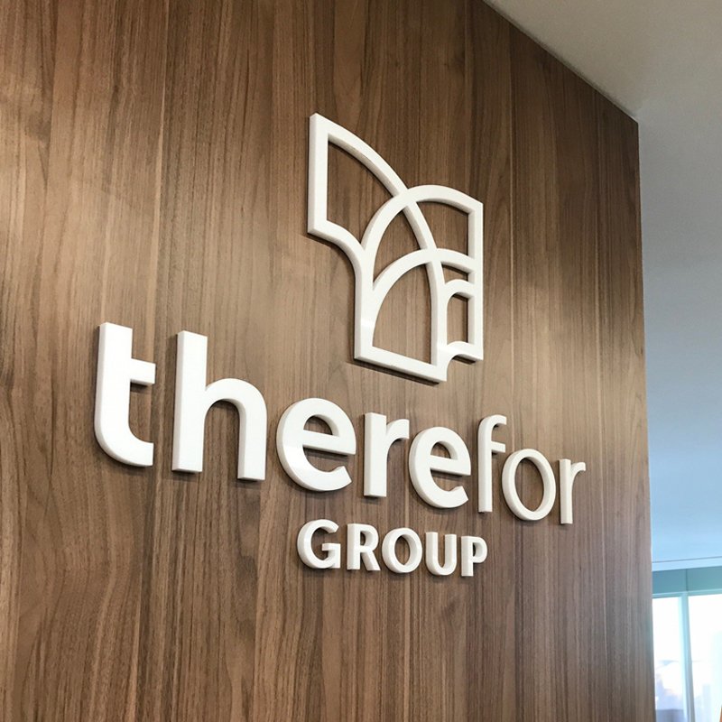
Numerous naming ideas were developed to convey the core brand idea of transformation/change and the creation of more value through expert leadership. The selected brand name was a play on words that, when shown in the context of the logo, conveyed the idea of a place (there) being unlocked for others.
The symbol shows an orange element (a nod to the original Wolters identity) leading in before bouncing out into a range of cooler green and aqua elements.
The shift to a green dominant colour palette was a strategic gap in the marketplace as well as correlating to imagery related to the environment and growth. It also provided a distinct shift from the original dominance of orange providing a clear before and after moment.
The symbol itself also draws on the fundamental shapes of a ‘TF’. The wordmark typography was also customized to echo the same forms as the symbol.
Brand development
The proposed identity was pitched and workshopped internally. The coupling of the visual identity to a strong brand idea meant that approval was quickly adopted and embraced. Part of the brand identity pitch included the ability to extend the name to include a campaignable ‘we’re there’ mantra that coupled with their role as industry leaders.
The core elements were expanded and coordinated with external providers such as the web design and videography teams to ensure consistency concurrent to the broader identity system being designed. We also worked closely with the external agents for written standards to flesh out how the brand speaks to accompany how it looks.
MODE then designed the broader visual system to work across printed items, reports, forms, digital, uniforms and signage for their new offices. Working closely with the client’s marketing team to coordinate everything for the official launch as part of the opening of the new head office.
Result
The use of a strong brand idea to underpin the identity design has led to a highly positive reception by staff and the market at large. The outcome is a testament to understanding the communication context and market coupled with a future-focused and confident client interesting in change leadership.